Code
# Load packages
library(MASS)
library(tidyverse)
library(effectsize)
library(knitr)

# Set the default ggplot theme
theme_set(theme_minimal())

# Set options
options(
  knitr.kable.NA = "",
  digits = 2
)In a previous post I covered how to perform simulation-based power analyses. A limitation in that post is that usually the question is not what our power is, but rather which sample size gives us the desired power. With the code from my previous post you can get to the right sample size by changing the sample size parameters and then checking whether this gives you enough power. It’s fine, but it’s a little bit of a hassle.
A more substantive, and related, limitation is that statistical power isn’t about a single threshold number that you’re supposed to reach. Power is a curve, after all. The difference between having obtained 79% power or 80% power is only 1% and does not strongly affect the interpretation of your obtained power. The code from my previous post doesn’t really illustrate this point, so let’s do that here.
If you want to follow along, run the following setup code:
# Load packages
library(MASS)
library(tidyverse)
library(effectsize)
library(knitr)
# Set the default ggplot theme
theme_set(theme_minimal())
# Set options
options(
knitr.kable.NA = "",
digits = 2
)Let’s look at one of the scenarios from the previous post: the two t-test scenario. We have one treatment condition and two control conditions. Our goal is to have enough power to find a significant difference between the treatment condition and both control conditions. Let’s begin with a single simulation, just to see what the data would look like.
# Parameters
M_control1 <- 5
M_control2 <- M_control1
M_treatment <- 5.5
SD_control1 <- 1
SD_control2 <- SD_control1
SD_treatment <- 1.5
N <- 50

# Simulate once
control1 <- mvrnorm(N, mu = M_control1, Sigma = SD_control1^2,
  empirical = TRUE)
control2 <- mvrnorm(N, mu = M_control2, Sigma = SD_control2^2,
  empirical = TRUE)
treatment <- mvrnorm(N, mu = M_treatment, Sigma = SD_treatment^2,
  empirical = TRUE)

# Prepare data
colnames(control1) <- "DV"
colnames(control2) <- "DV"
colnames(treatment) <- "DV"

control1 <- control1 %>%
  as_tibble() %>%
  mutate(condition = "control 1")

control2 <- control2 %>%
  as_tibble() %>%
  mutate(condition = "control 2")

treatment <- treatment %>%
  as_tibble() %>%
  mutate(condition = "treatment")

data <- bind_rows(control1, control2, treatment)
I’ve changed the code a little bit compared to my previous post. We still assume the same parameters in both control conditions, but now I use one of the control condition variables to set the value of the variable from the other control condition. This means you only need to set the value once and this reduces mistakes due to typos. In addition, we assume the same sample size in each condition and I also changed the parameter values.
We inspect the data by visualizing it and by calculating a standardized effect size that quantifies the difference between the treatment condition and each of the two control conditions.
# Calculate standardized effect size
effect_size <- cohens_d(DV ~ condition, pooled_sd = FALSE,
  data = filter(data, condition != "control 1"))

# Visualize the data
ggplot(data, aes(x = condition, y = DV)) +
  geom_jitter(width = .2, alpha = .25) +
  stat_summary(fun.data = "mean_cl_boot", geom = "pointrange") +
  labs(x = "Condition")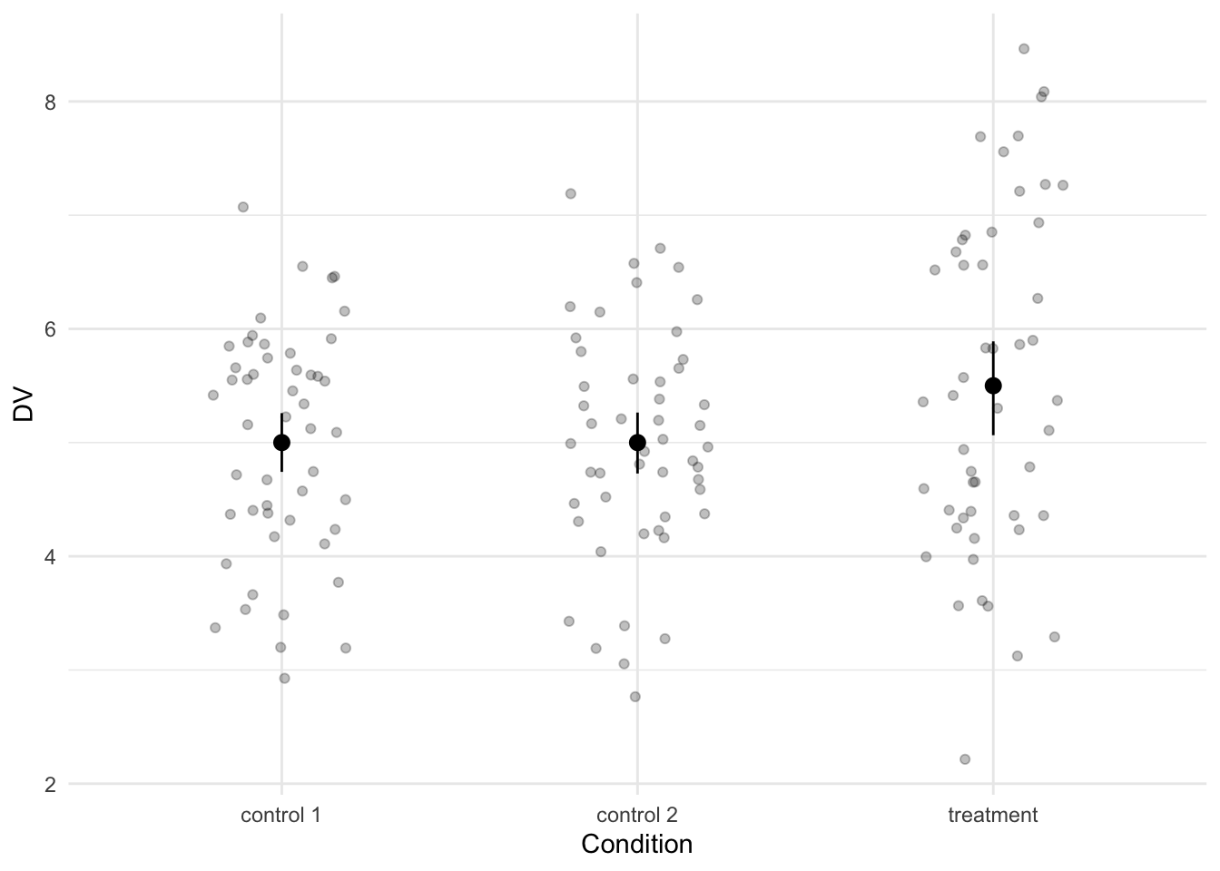
The effect size is a Cohen’s d -0.39 and although the Cohen’s d is negative (due to the ordering the levels in the condition column), the values in the treatment condition are higher than in the control conditions.
As a reminder, I think we should analyze this data with two Welch’s two sample t-tests: one for the difference between the treatment condition and control group 1 and also one between the treatment condition and control group 2. Below is some code to run these tests with the current data frame.
t.test(DV ~ condition, data = filter(data, condition != "control 1"))
t.test(DV ~ condition, data = filter(data, condition != "control 2"))Next we want to calculate the power. However, we don’t just want the power for a single sample size. We want to calculate the power for a range of sample sizes. So we begin by defining this range. In the example below, we create a variable called Ns that contains a sequence of values ranging from 50 to 250, in steps of 50. We also define S, which is the number of iterations in the power analysis. The higher this number, the more accurate the power analysis. Note that I’ve capitalized it this time. The final simulation parameter is i. I’ve defined this variable to keep track of how often we loop. This will be useful for figuring out where to store the p-values.
We will store the p-values in a data frame this time. Using the crossing() function, we can create a data frame that contains all possible combinations of the sample sizes and the number of simulation iterations. We can also already add some empty columns to store the p-values in.
After that, we begin the loop. We want to loop over each sample size and we want to loop S times for each sample size, running the analyses in every single loop. This means we have a nested for loop. This is not particularly difficult, as we can simply put a for loop within a for loop. The only trick bit is to make sure that you store the p-values correctly. That’s where the i variable comes in. We initially gave it a value of 1, so the first p-values will be stored in the first row. At the end of each loop we increment it by 1, making sure that the next p-values will be stored in the next row of our p-values data frame.
# Set simulation parameters
Ns <- seq(from = 50, to = 250, by = 50)
S <- 1000
i <- 1

# Create a data frame to store the p-values in
p_values <- crossing(
  n = Ns,
  s = 1:S,
  p_value1 = NA,
  p_value2 = NA
)

# Loop
for (n in Ns) {
  for (s in 1:S) {
    # Simulate
    control1 <- mvrnorm(n, mu = M_control1, Sigma = SD_control1^2)
    control2 <- mvrnorm(n, mu = M_control2, Sigma = SD_control2^2)
    treatment <- mvrnorm(n, mu = M_treatment, Sigma = SD_treatment^2)

    # Run tests
    test1 <- t.test(control1[, 1], treatment[, 1])
    test2 <- t.test(control2[, 1], treatment[, 1])

    # Extract p-values
    p_values$p_value1[i] <- test1$p.value
    p_values$p_value2[i] <- test2$p.value

    # Increment i
    i <- i + 1
  }
}
The result is a data frame with two columns containing p-values. To calculate the power, we sum the number of times we find a significant effect in both columns and divide it by the number of iterations per sample size (S). We need to do this for each sample size. The following code does the trick:
power <- p_values %>%
  mutate(success = if_else(p_value1 < .05 & p_value2 < .05, 1, 0)) %>%
  group_by(n) %>%
summarize(power = sum(success) / S)With the power for each sample size calculated, we can visualize the power curve.
ggplot(power, aes(x = n, y = power)) +
  geom_line(linetype = 2) +
  geom_point() +
  geom_hline(yintercept = .80, linetype = 3) +
  geom_hline(yintercept = .95, linetype = 3) +
  scale_y_continuous(labels = scales::percent, limits = c(0, 1)) +
  labs(x = "Sample size (n) per condition", y = "Power")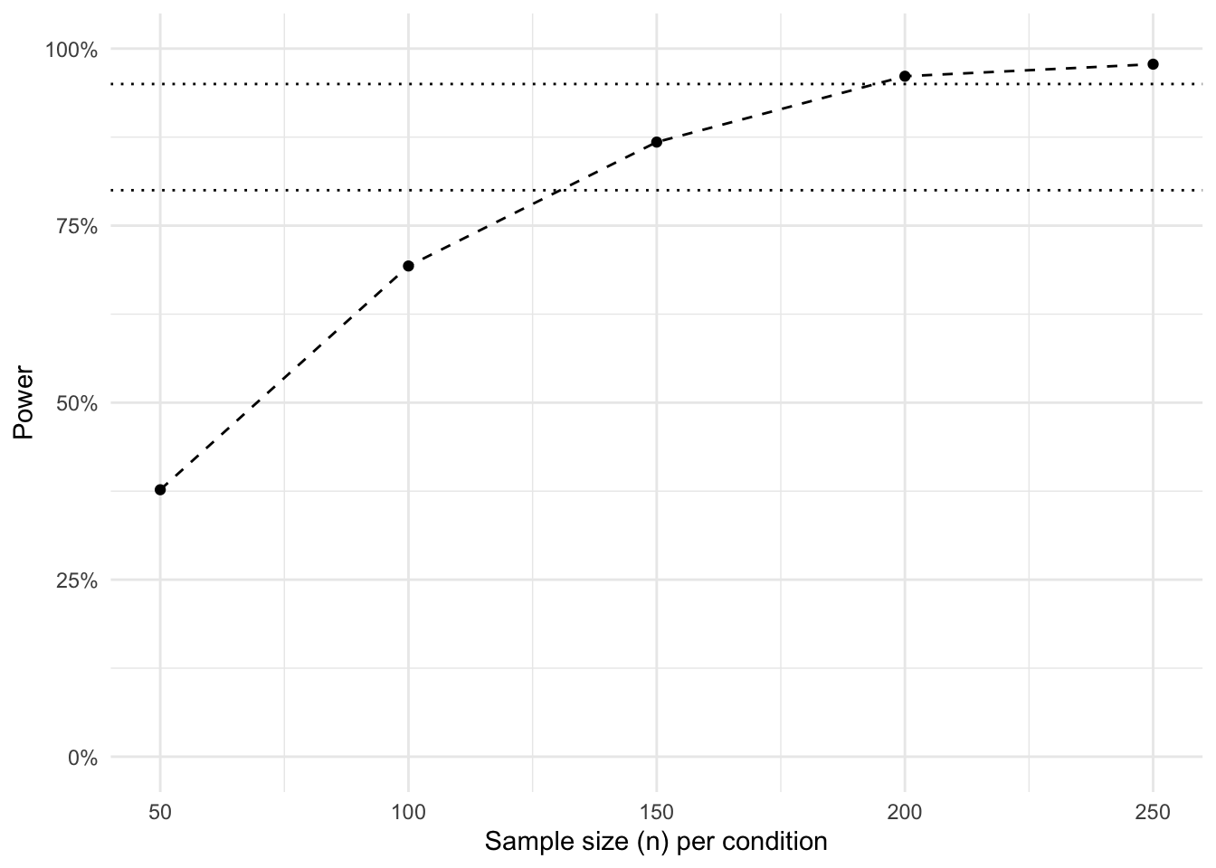
That’s it. We can see at which point we have enough power (e.g., 80% or 95%). Do note that we calculated the sample size per condition. In the current scenario, this means you need to multiply the sample size by three in order to obtain your total sample size.
If you want a smoother graph, you can adjust the range of sample sizes that we stored in the Ns variable. You can, for example, lower the by argument in the seq() function to get a more fine-grained curve.
This post was last updated on 2022-04-29.